1. Too many price variations
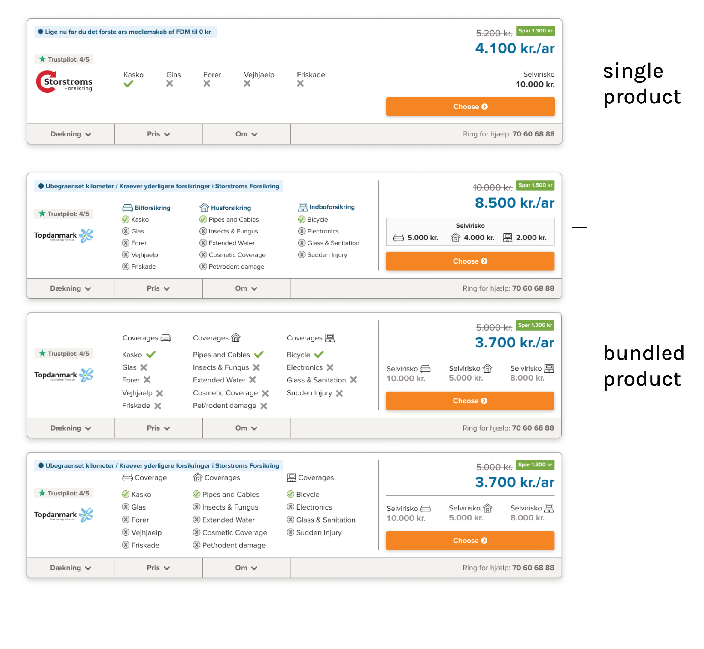
"Bundled" Insurance Products
UX/UI Design - Web Design
Context
Samlino.dk is a financial comparison tool that allow people to find the best insurance for themselves while saving time & money.
This project is about the results page of Samlino.dk’s insurance product. In the results page, users should be able to compare a “bundle” (more than one) of insurances. Initially Samlino.dk only provided a comparison of car insurance. This project would allow Samlino.dk to add home, contents and accident insurance to their comparison bundle.
The Goal
Build a results page where Samlino.dk can provide more than one insurances to their users to compare fast & easy.
Business Opportunity
Among its comparison services, Samlino.dk could add comparing more than one insurances and provide a “bundled” offer to increase their profits.
Tools
-
Figma
Team
-
1 UX/UI designer
-
1 Head of Product
My Role
-
UX design
-
UI Design
Timeline
-
October-March 2021
(5 months)
My Design Process
Competitor Analysis
As the business we are aware that our buyer's intent is to "compare offers" or "find the cheapest insurance". Looking at our competitors, we see it is our advantage if we are able to show them offers and provide them detailed comparisons right away, we would be aligning with the user's expectations and differentiating ourselves from the competition.
In Denmark, only 1 comparison site with a results page, many others that share results through email in 1-2 business days.
Sketches
We began the design process with countless sketches in Figma, mostly in high-fidelity. During this period there were a lot of back and forth of sharing the sketches with the business and development teams for feedback. Based on my previous experiences in the company, sharing high fidelity designs with the extended team dramatically increased the efficiency of communication and allowed us to work with the best quality feedback. The main reason of these initial sketches were not to reach a solution, they rather aimed to pinpoint the challenges that would arise with the implementation of the project.
Challenges we came across during our sketches:
-
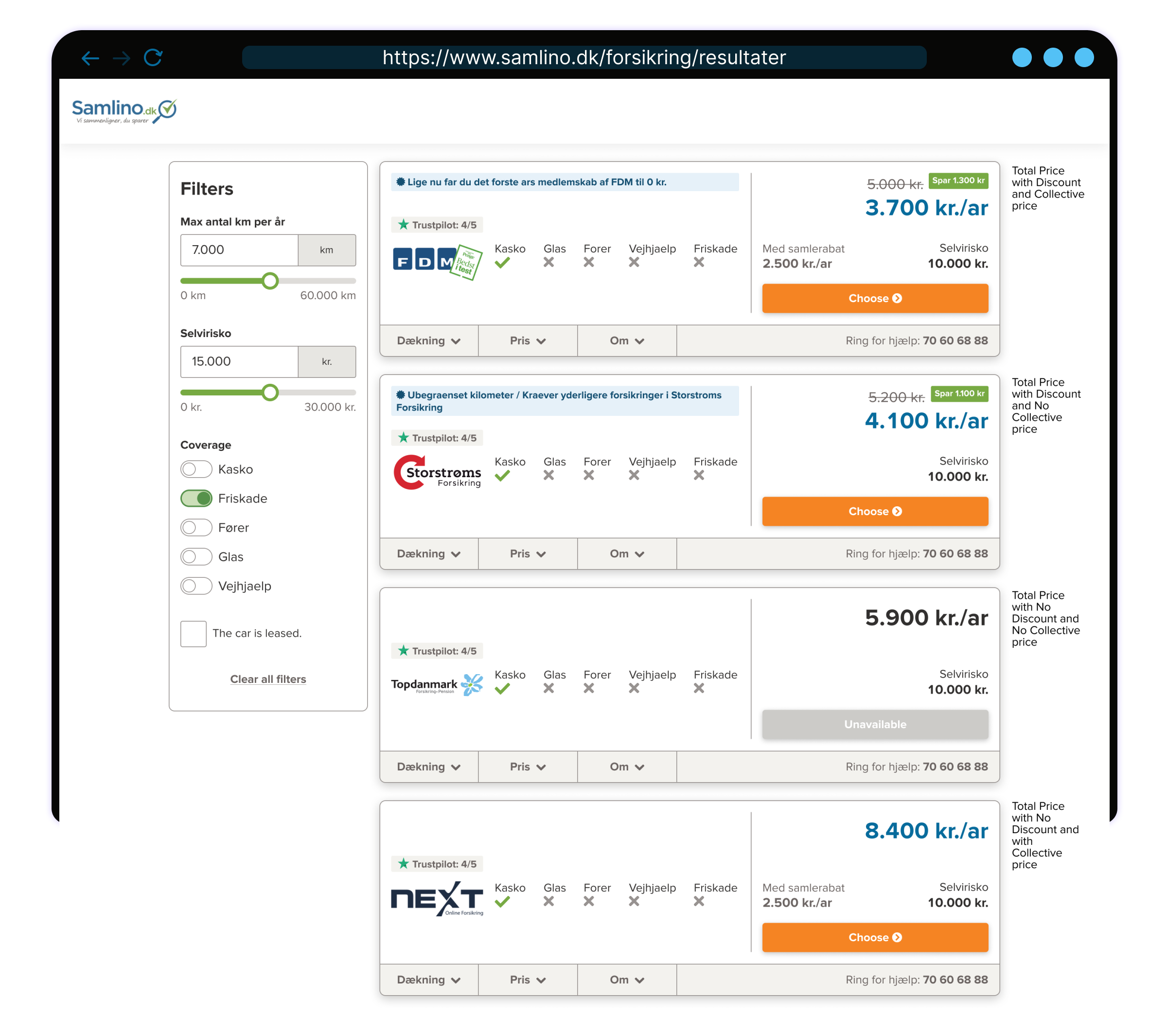
Too many price variations that need to be arranged to provide an easy comparison between offers
-
Filter section becomes too long with each insurance added
-
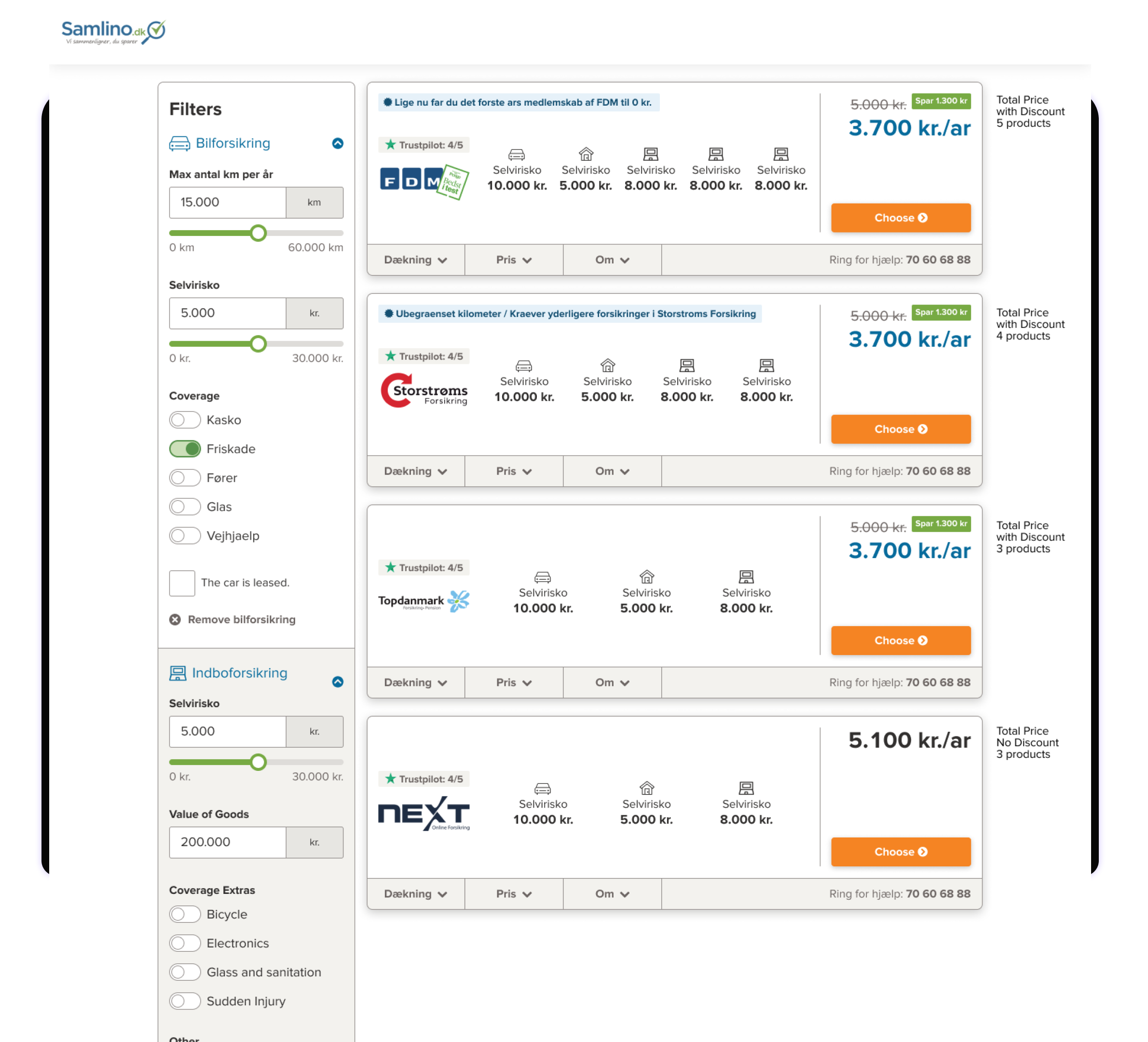
Each insurance has different coverages that needs to be compared
-
A lot of information to squeeze in mobile layout
***The designs shown in the gallery below are part of the sketching process , and they are not final desings.***
Some of what has been sketched.
-
-
2. Filter section too long
-
3.Comparing all coverages for each insurance
-
4. All of this but in a small device
UI Design
For the UI of the results page, we followed the visual style of the results page of our other products, the broadband results page (designed by previous designer) and personal loans results page (designed by me). The UI has a modern look, with a lot of white space utilized to allow for information to breathe and be easily scanned. We initially designed all pages in Desktop and Mobile and then added tablet designs to support the developers during implementation.
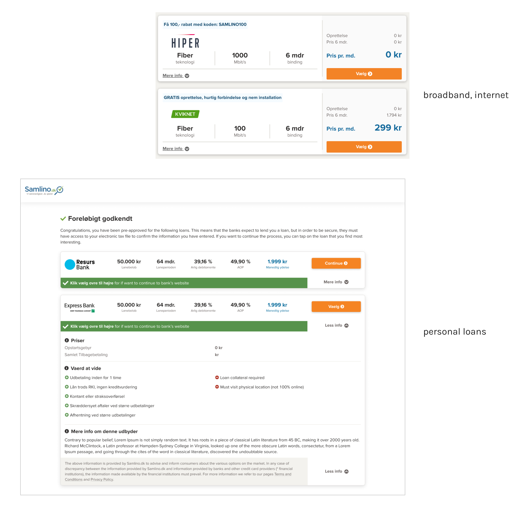
Results page of broadband and personal loan comparison products.
Design Handoff
An extensive design handoff file was prepared in parallel to the UI Design. All the specifications are added with the consultation of the developers. They were actively involved in the process, especially during the setting of the grid system for the card layouts. The handoff file included:
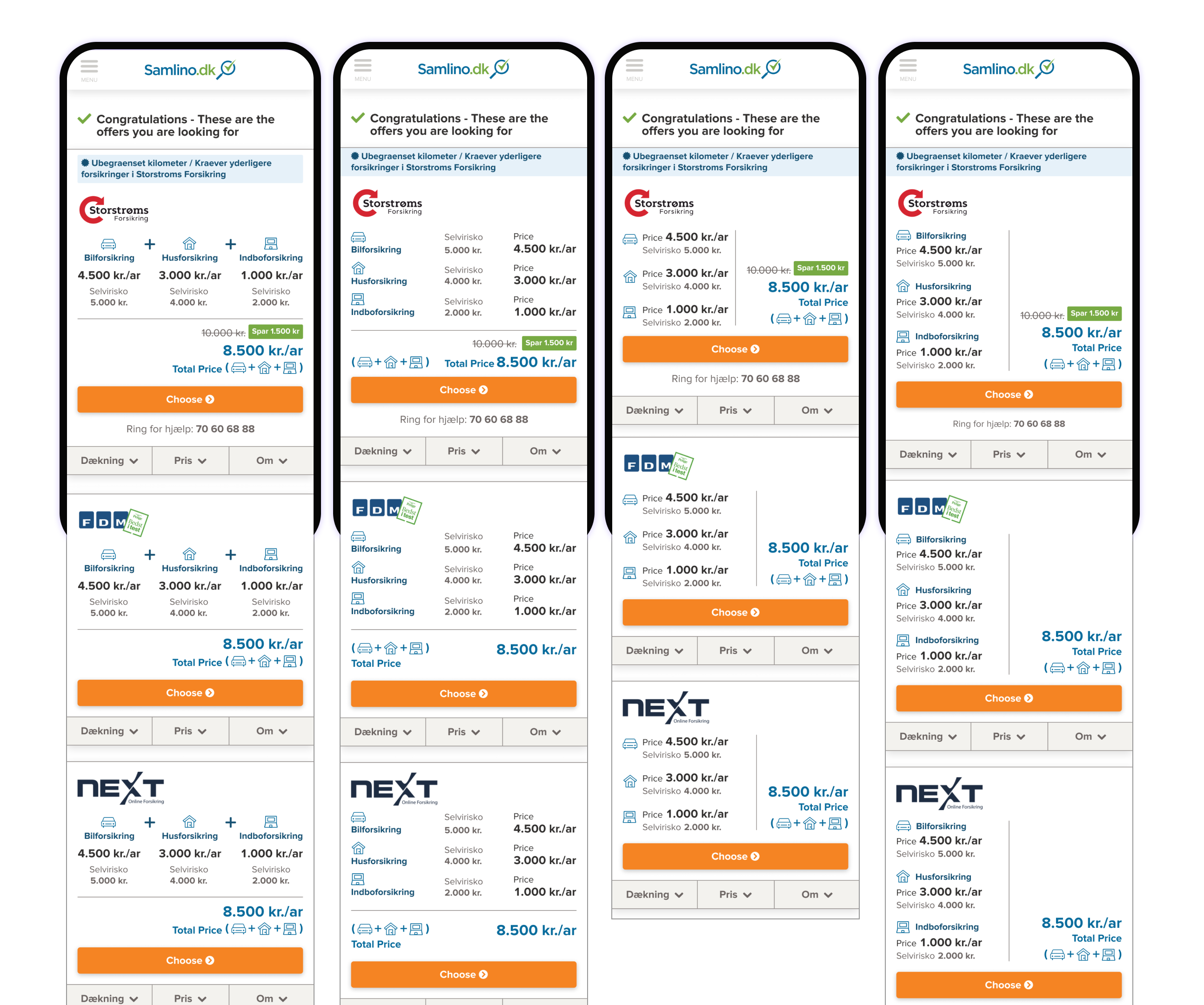
1. the designs variations with 1, 2, 3 and 4 products shown in 4 different screen sizes (desktop, tablet horizontal, tablet vertical & mobile).
2. Expanded and collapsed versions of the offer cards.
3. Views of each tab in the offers cards (Coverage, Price and About tabs).
4. Views of mobile layout in smaller screens.
5. The grid settings for desktop & mobile.
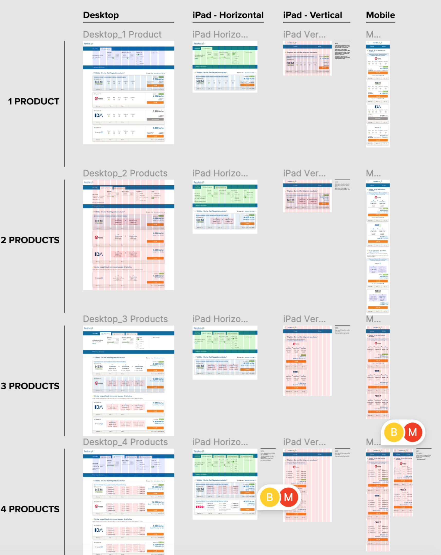
Ultra zoomed-out version showing part of the handoff file.
Tab designs shown in each expanded card.
Tab designs shown in each expanded card.
What happened after?
After about 6 months of the project going live the business side decided to put the "bundled" offers on hold and focus on the single product offers for each type of insurance (home, contents & accident). The reason of this was there wasn't enough offers from the providers. Samlino.dk needed to make deals with more providers that are able to provide "bundled" offers.
Future Plans
Within the timeline of this project, it was learnt that 12% percent of users buying home and contents insurance were buying these two insurances as a "bundle". Samlino.dk plans to offer a bundling of these insurances in the future.
Learnings
This was a project that helped me hone my UI skills further and improve my design handoff. It was the first big and complex project that I completed in Samlino.dk. During this project, I was in continuous communication with developers. Having worked in a design agency before, this has been my first chance to work with developers for a longer period of time. It taught me the importance of having included developers from the start. This project later on inspired me to write my master thesis in Interaction Design focusing on the subject of Design Handoffs.
Thank you for reading my first big UI project as an in-house designer!
Want to work with me? Feel free to contact me!